B2B SaaS Website Relaunches: 5 Ways to Stand Out in 2022

B2C websites are known for their parallax scrolling, beautiful images, and interactive design. That’s no accident.
Not only are these features appealing, they also give prospects the confidence that products or services they buy will be as exciting, luxurious, and fun as the website feels.
Why shouldn’t B2B leads get the same experience?
We know the B2B buying landscape is changing. Prospects want to try before they buy, and they don’t necessarily want to spend time talking to a salesperson.
Leading B2B companies have adapted to this shift in buying behavior, transforming their SaaS websites into personalized, product-focused selling tools.
5 Ways to Stand Out for your Next Website Relaunch
Below, we’ll highlight five essential components of a standout B2B website and showcase several examples of companies using those techniques to their advantage. Consider adding some of these into your next website relaunch.
1. More CTAs With Greater Variation
Every marketer knows calls to action (CTAs) are important, but unfortunately, this has translated to adding a “book a demo” button to the top or bottom of every page.
Pushing all your prospective buyers to schedule a demo doesn’t match the way many potential buyers want to buy.
As our Head of Growth & Operations, Natalie Marcotullio, puts it, “The old marketing wisdom was to have a single funnel, drive every lead to the same CTA, but now there are multiple paths because the way I want to buy might be different from how someone else wants to buy.”
And yet, of the 5,600 B2B SaaS websites we studied, over 40% had demo-based CTAs, and only 12% had trial-based CTAs.
If each buyer’s journey is different, why are demo CTAs still taking the lead? By varying your CTAs, you increase the chances of meeting prospects where they are in the buyer journey.
ShiftLeft does an excellent job of adding different CTAs throughout their website. On the home page alone, there are six.
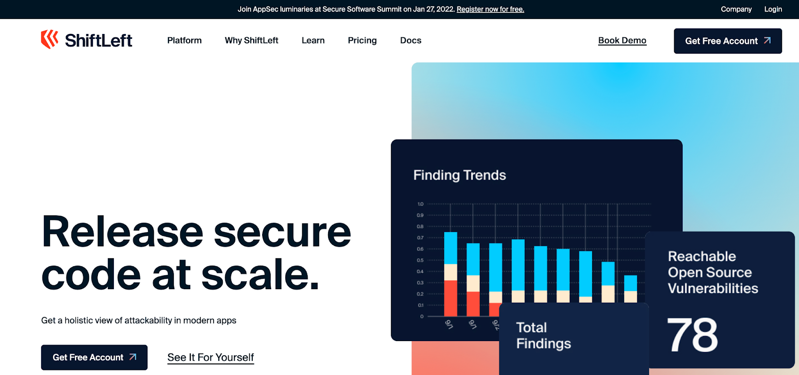
At the very top, you see a banner inviting users to register for the Secure Software Summit. There, prospects can learn more about what ShiftLeft does and how it might benefit their business.
There’s a traditional Book a Demo link in the upper right with a Get Free Account button next to it. Pairing these two CTAs gives ShiftLeft prospects the choice to talk to a rep, get a taste of the product on their own time, or both.
As users scroll, they come across two more CTAs一another Get Free Account button, and a See it For Yourself link. Again, users are presented with an option: do a ShiftLeft test drive themselves or walk through a product tour.
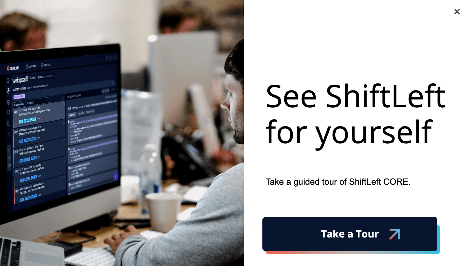
And after spending a few seconds on the home page, users get a pop-up encouraging them to take a guided tour.
But you don’t have to follow ShiftLeft’s footsteps exactly. Instead, tailor your CTAs to parts of your customers’ unique journeys.
That could mean prompting visitors to sign up for free trials, watch product overview videos, interact with product demos or tours, or learn more about your product by downloading a guide.
2. Interactive Design
Getting people’s attention is hard, but keeping it is even harder.
Many B2B SaaS companies like Block, Asana, and Hotjar have turned to interactive design to grab and hold prospects’ attention. On their websites, fonts change colors and shapes move as visitors scroll or move their mouse.
These tiny changes keep visitors intrigued and engaged, wondering what is coming next. PLG companies can take this concept to the next level by offering interactive product tours.
For example, Front, a customer communication platform, puts its interactive product tour front right on its website.
Once in the tour, prospects are guided through use cases step-by-step. And for each major feature, Front’s helpful pop-ups explain what it is, what it does, and why it is beneficial.
To make the tour even more interactive, Front invites prospects to partake in activities like clicking buttons, copying and pasting text, and more to see what happens next.
The best part is that, on the backend, Front can track how far a prospect has made it through the tour一a valuable indicator of prospects’ interests that salespeople can use down the line.
3. Focus Even More on The Product
Companies can no longer afford to hide their product.
In a PLG-focused world, users expect to see products featured prominently on your site, in video, tour, screenshot, and gif form.
The best websites integrate their product so well that you witness their value proposition immediately.
For instance, Clearbit, a real-time intelligence platform, shows you example data their platform can pull as soon as you arrive on the homepage:
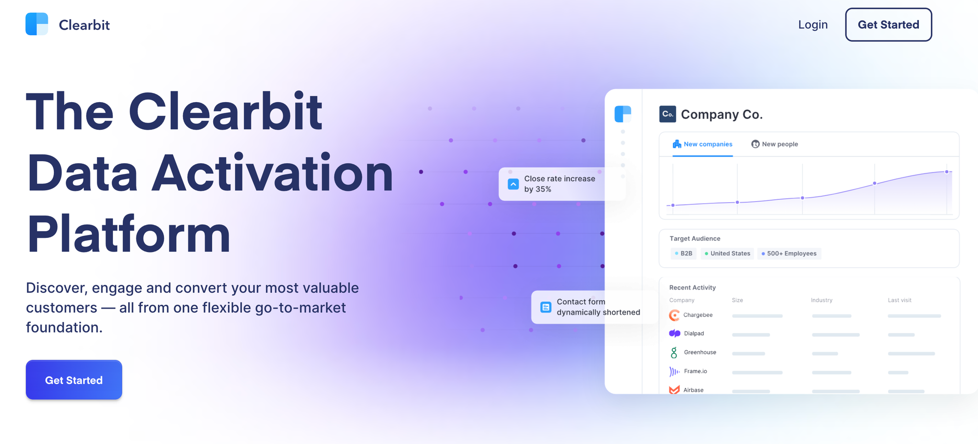
Hitting potential customers with this knowledge right off the bat gets them thinking about ways they can leverage Clearbit to personalize customer journeys, alert sales to VIPs, and track outcomes without having to use cookies.
Ahrefs also puts their product front and center but takes a slightly different tack.
Instead of showing off their product as part of interacting with their website, they offer free tools that are mini versions of their product.
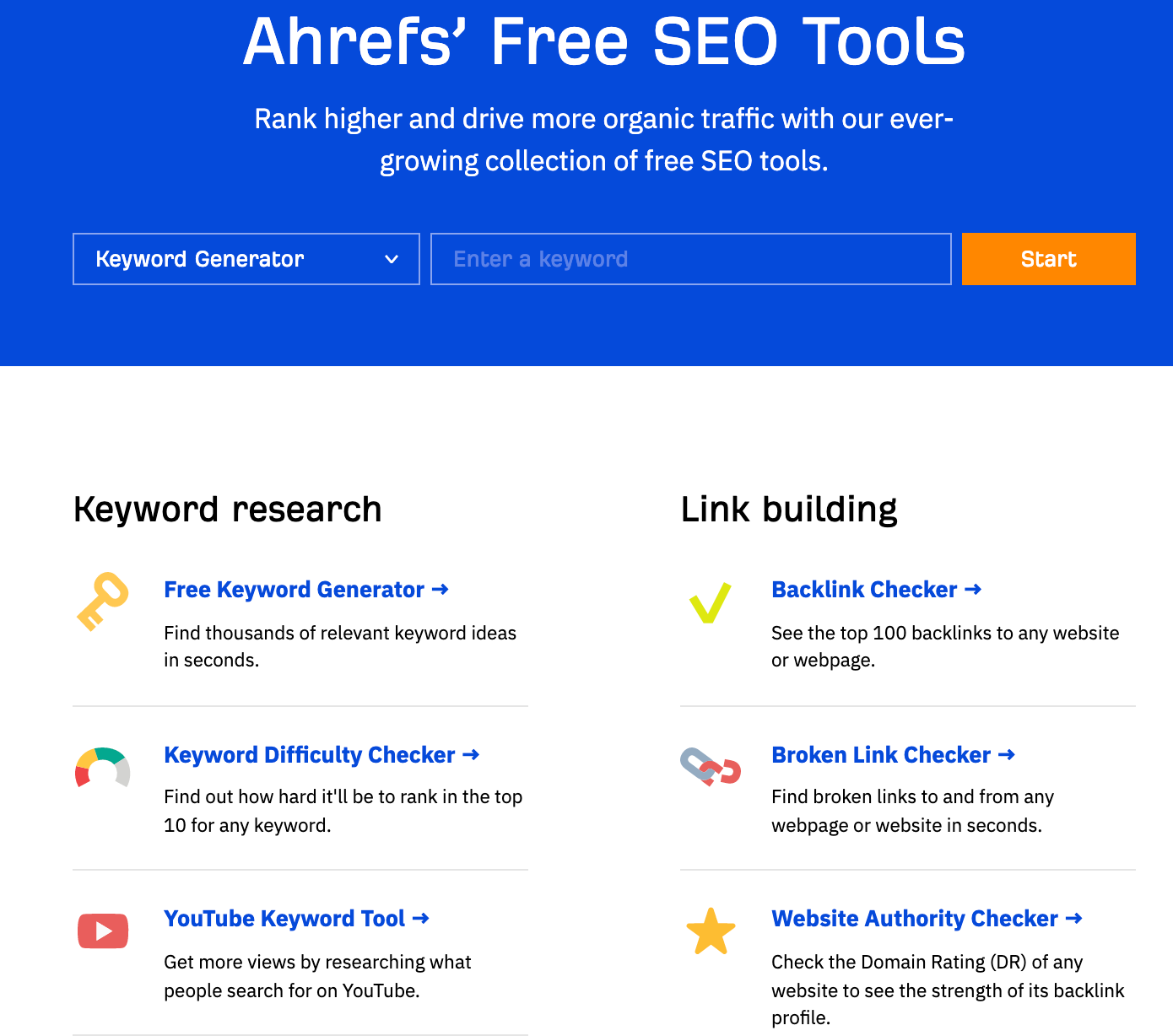
As users fiddle with these free SEO tools, they are (1) getting value from an Ahrefs product and (2) learning how to use Ahrefs before they buy.
In this way, Ahrefs hooks people in, already demonstrating value but teasing that even more value awaits customers in the full-blown product.
4. Short, But Convincing Copy
B2B buyers are strapped for time. They want to understand what your product does and how it benefits them一fast.
And for the most part, they’d rather spend time using your product than read lengthy web pages.
Although there’s no golden rule in terms of length, readers’ natural tendency is to skim. Ideal headlines are 10 words or less.
Now, that’s not a lot of words to get your message across, so B2B companies have focused on writing hard-hitting copy to supplement product-focused images or gifs.
One of the most well-known PLG companies, Notion, does this exceptionally well.
The copy on their site is minimal but packs a punch, especially when positioned right next to a gif of their product exemplifying it.
One of our customers, Athennian, has also embraced short yet powerful copy to simplify a fairly complex product.
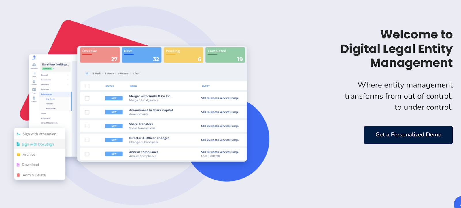
Their play on being out of versus in control is memorable, and the screenshot of their product shows how streamlined entity management can be.
Athennian also repeats the in and out of control phrase in pop-ups and other calls to action on their site:
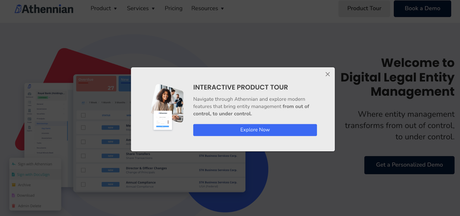
Using this refrain throughout their site reinforces their messaging and subtly encourages ideal customers to make their lives easier by purchasing Athennian.
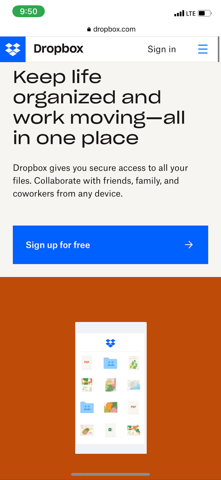
5. Mobile-First Design
Google’s algorithm is constantly changing, but one thing has remained the same: it favors mobile-first design on B2B sites.
Dropbox has taken great strides to enhance the mobile experience. They have short and sweet tagline, a mobile-friendly gif, and a big button that takes users to a free trial.
Their mobile site is optimized for readability, with a few short sentences to explain exactly how their product streamlines remote work, keeps your family organized, and more with carrots to expand or contract information when you need to.
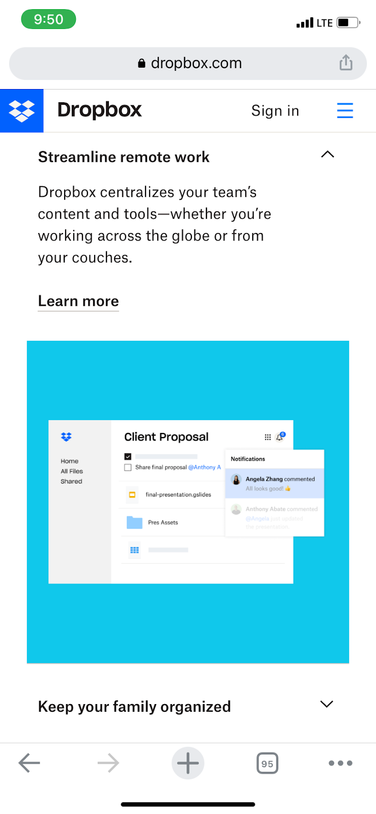
As users scroll, they see Dropbox’s various integrations with indicated with a simple logo, and plenty of social proof to nudge prospects along in the customer journey.
Optimize Your B2B SaaS Website for your Next Relaunch
Optimizing your B2B website to fit each ideal customer’s unique journey takes thoughtful CTAs, intuitive design, mobile-friendliness, smart copy, and, most of all, putting your product first.
Starting to incorporate your product into your website can be as easy as adding an interactive product tour. Check out our website to see more examples of interactive product tours.
Turn demos into deals.
Build interactive product demos that engage buyers and close deals faster.